How to select and style high-contrast outfits while keeping them modern and wearable through balance and proportion.
Discover practical strategies for creating bold, high-contrast looks that feel fresh and wearable by balancing elements, proportion, and texture to suit any body type and lifestyle.
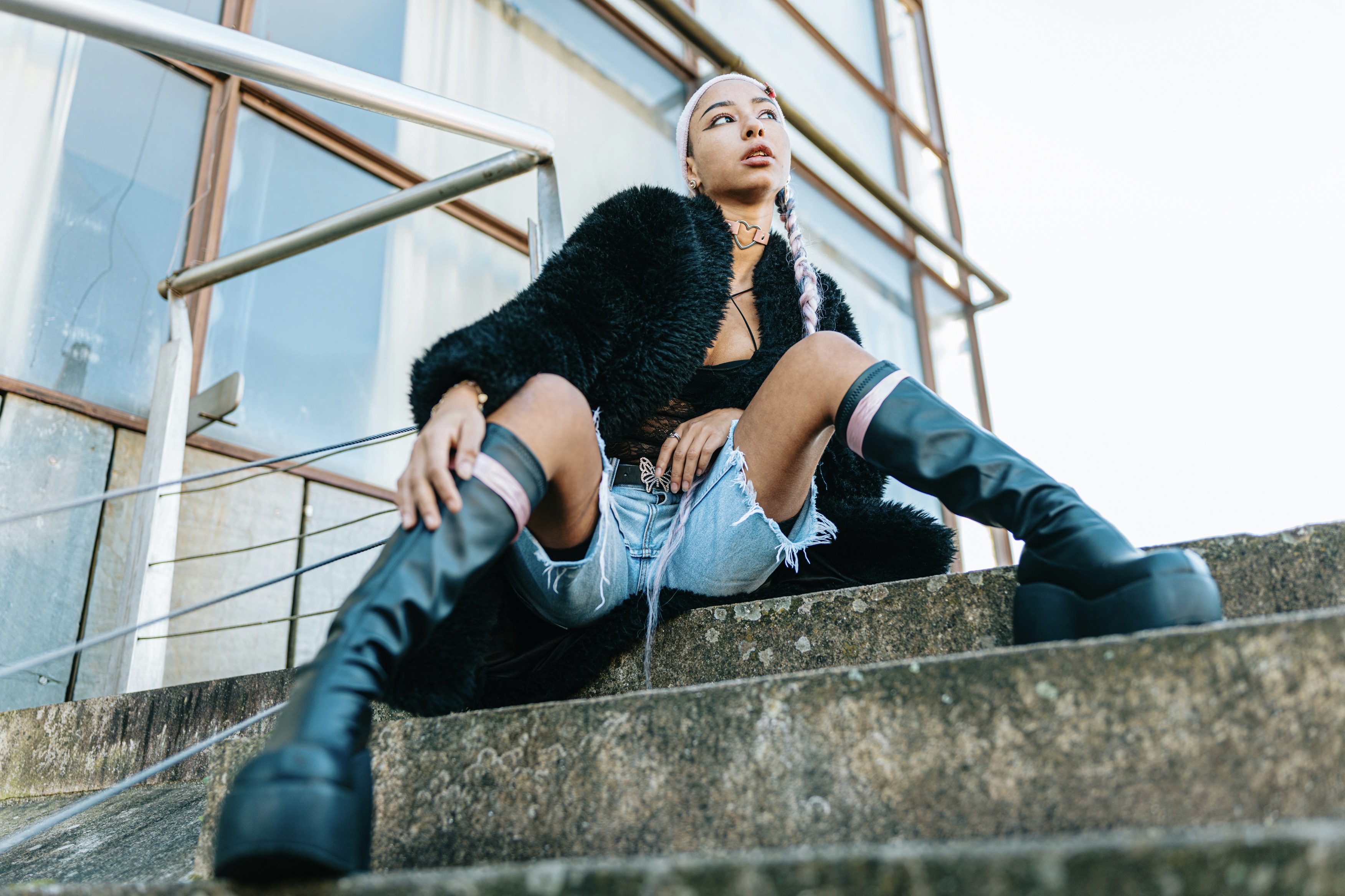
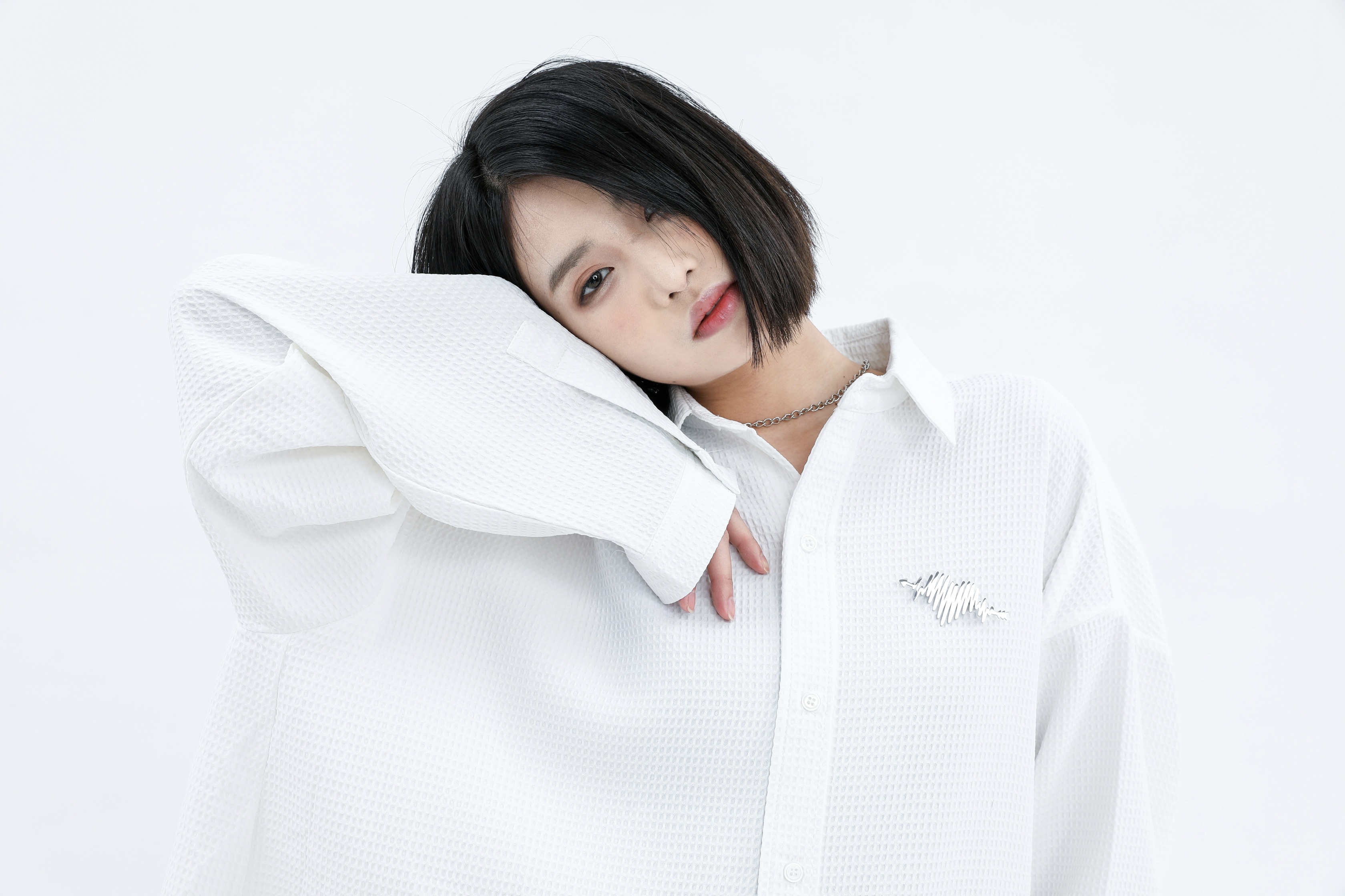
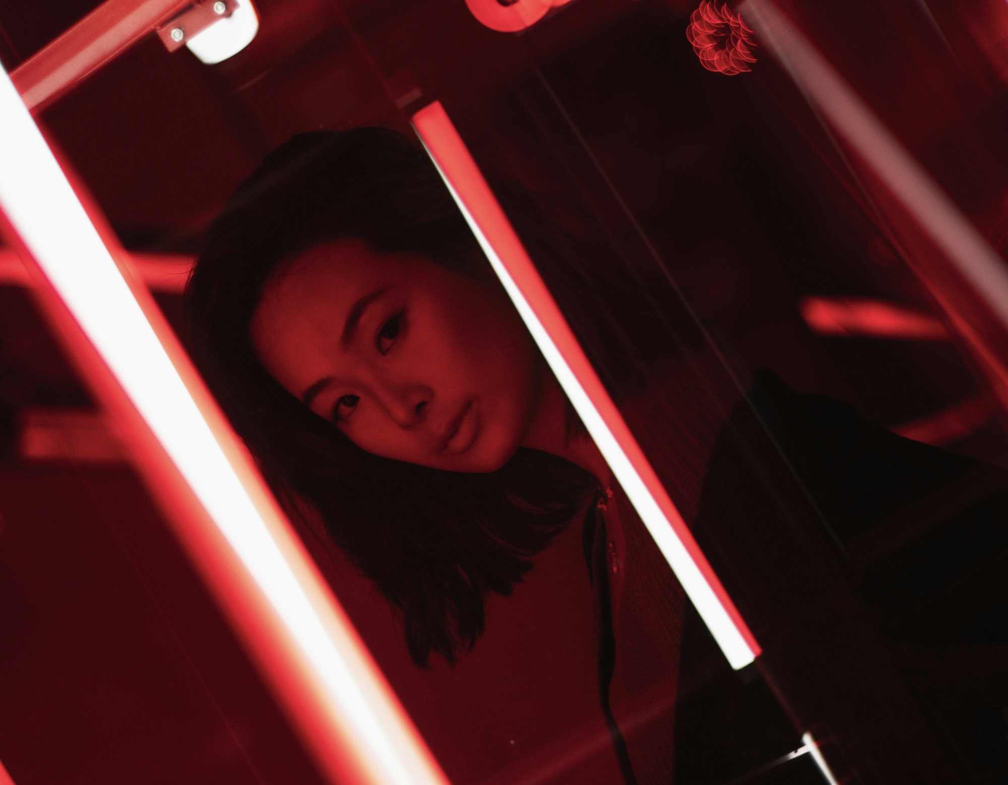
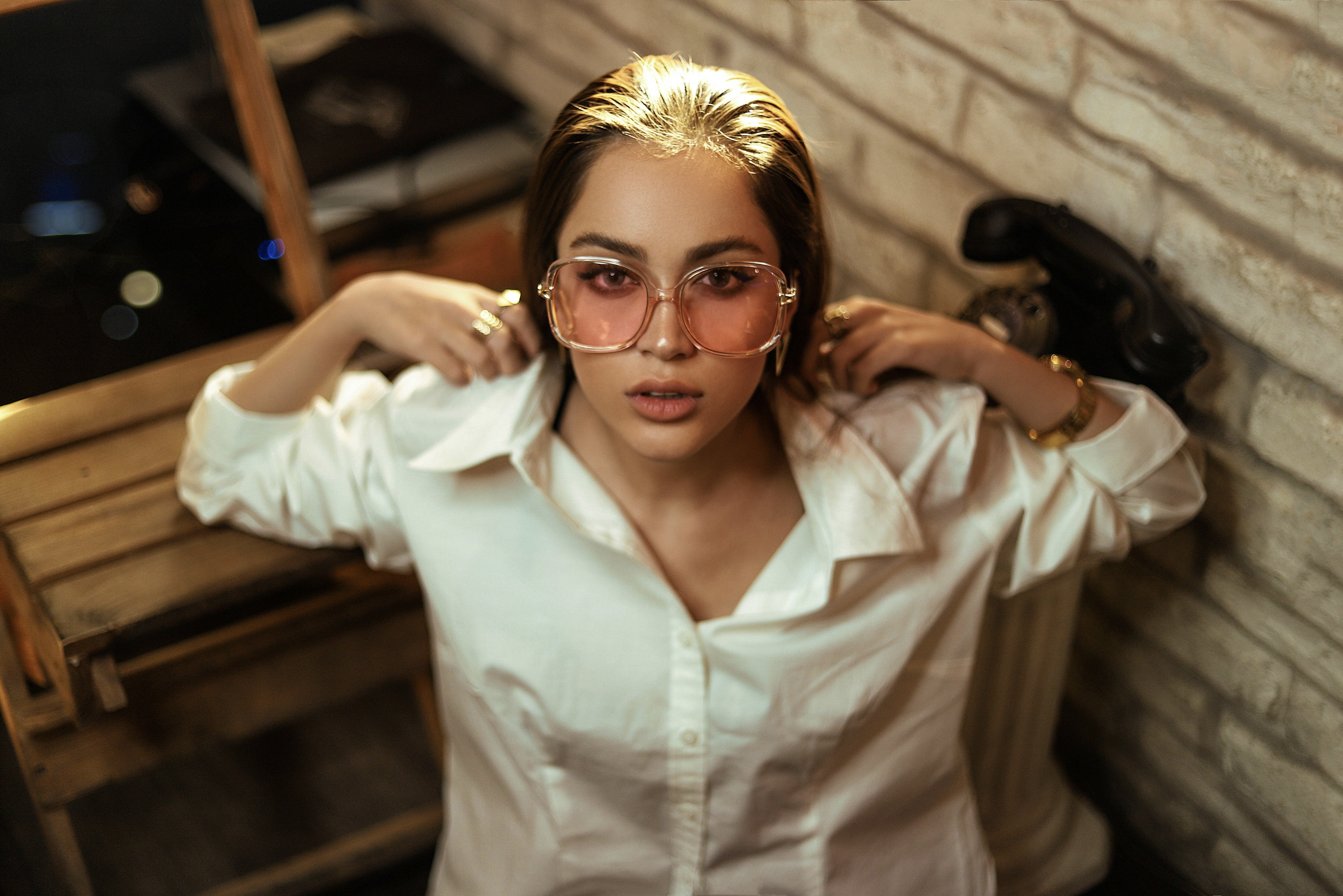
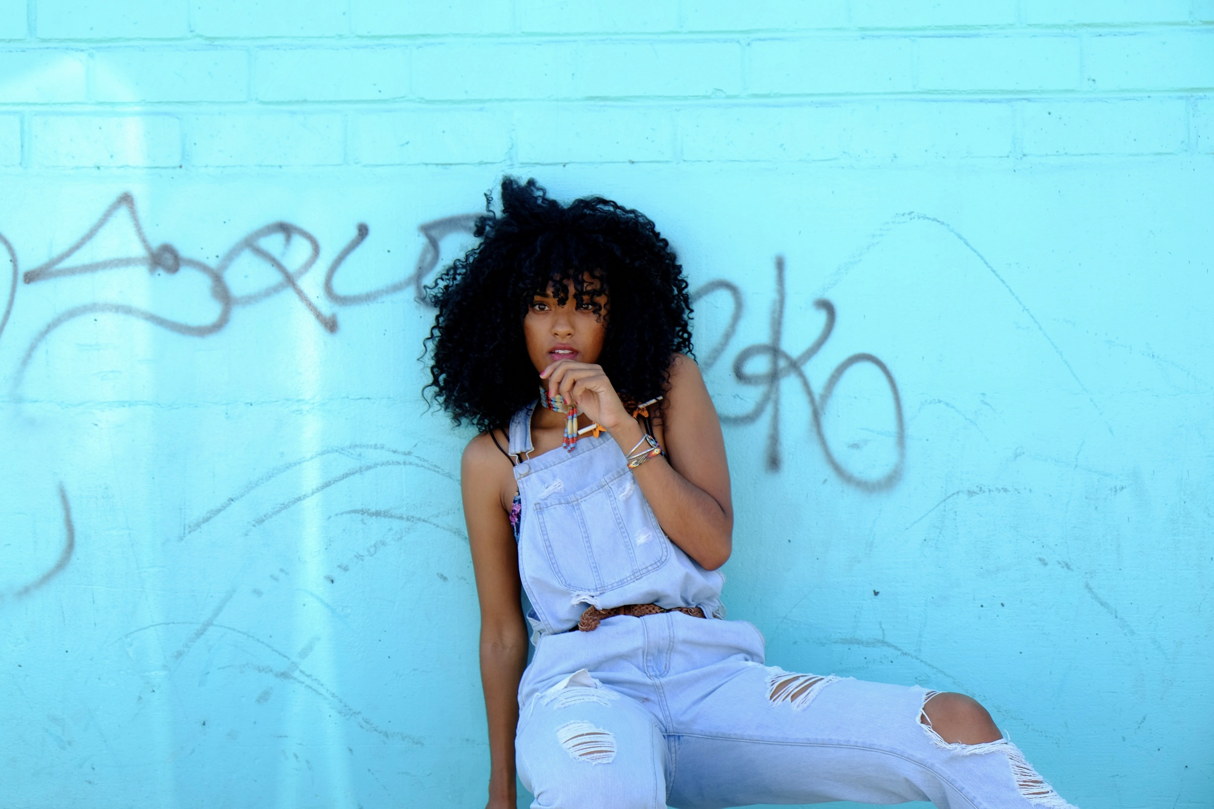
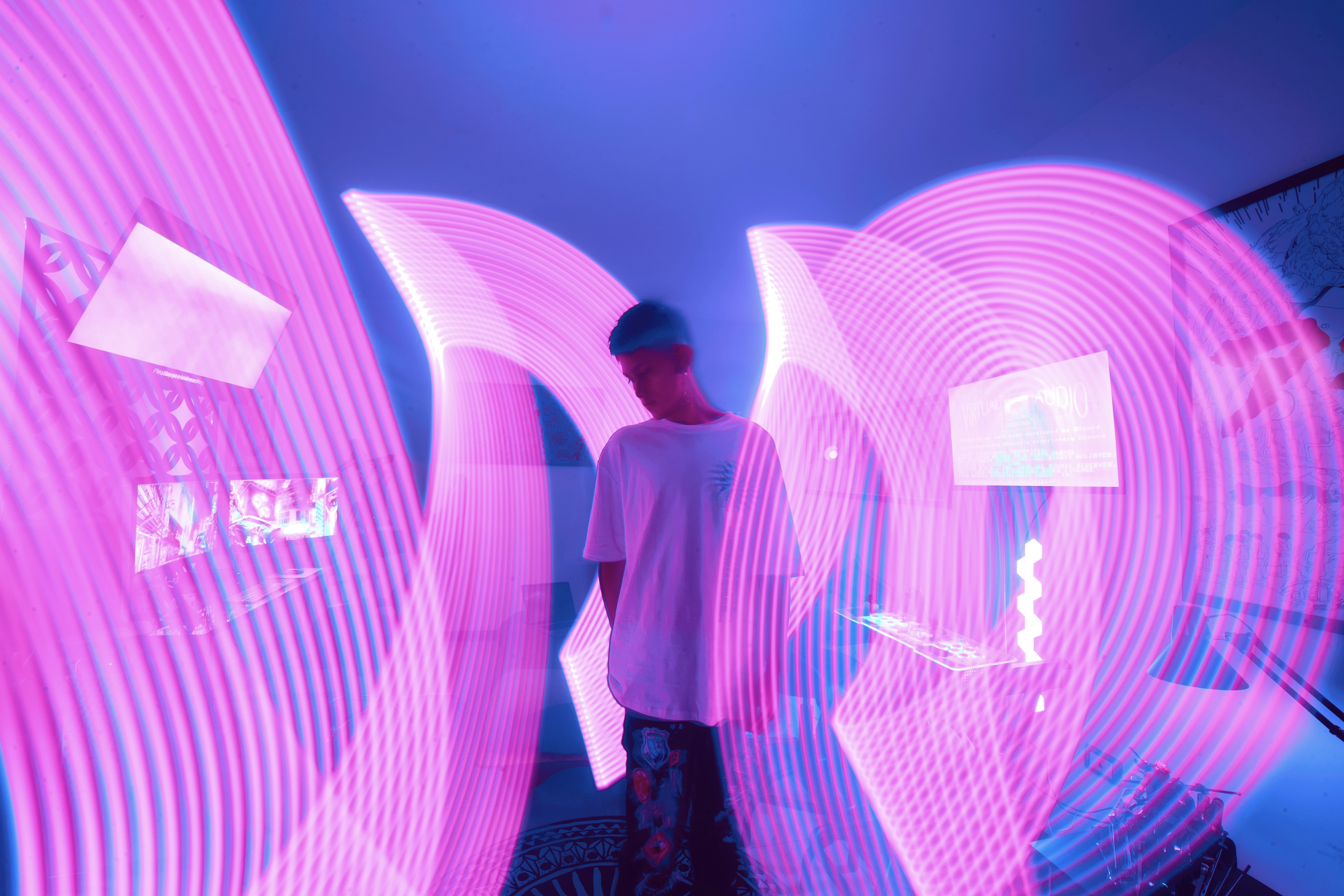
High-contrast dressing invites energy into a wardrobe, yet the trick lies in thoughtful balance rather than sheer loudness. Start with a dominant base color—black, navy, or charcoal, for example—and introduce a secondary hue with intention. The goal is to create a visual anchor that guides the eye and prevents the outfit from shouting. Consider the weight of fabrics as a crucial balancing act: a dense wool or leather piece grounds a bright blouse, while a satin skirt can elevate a muted top without overwhelming the stance. Even when colors clash boldly, purposeful proportions keep the ensemble refined and modern.
Proportion is the silent architect behind successful high-contrast styling. When you place a vivid color in a small area, like a pocket square or shoes, the rest of the silhouette should remain streamlined to avoid overwhelm. Conversely, a large block of a bright hue demands more structure in the accessories and footwear to anchor the eye. Play with vertical lines to elongate the frame: long jackets, slim trousers, and monochromatic bases. Introduce a single bold element at one focal point to preserve harmony. This approach makes striking color combinations feel deliberate, not accidental, ensuring modernity and wearability.
Texture and scale shape how contrast translates on the body.
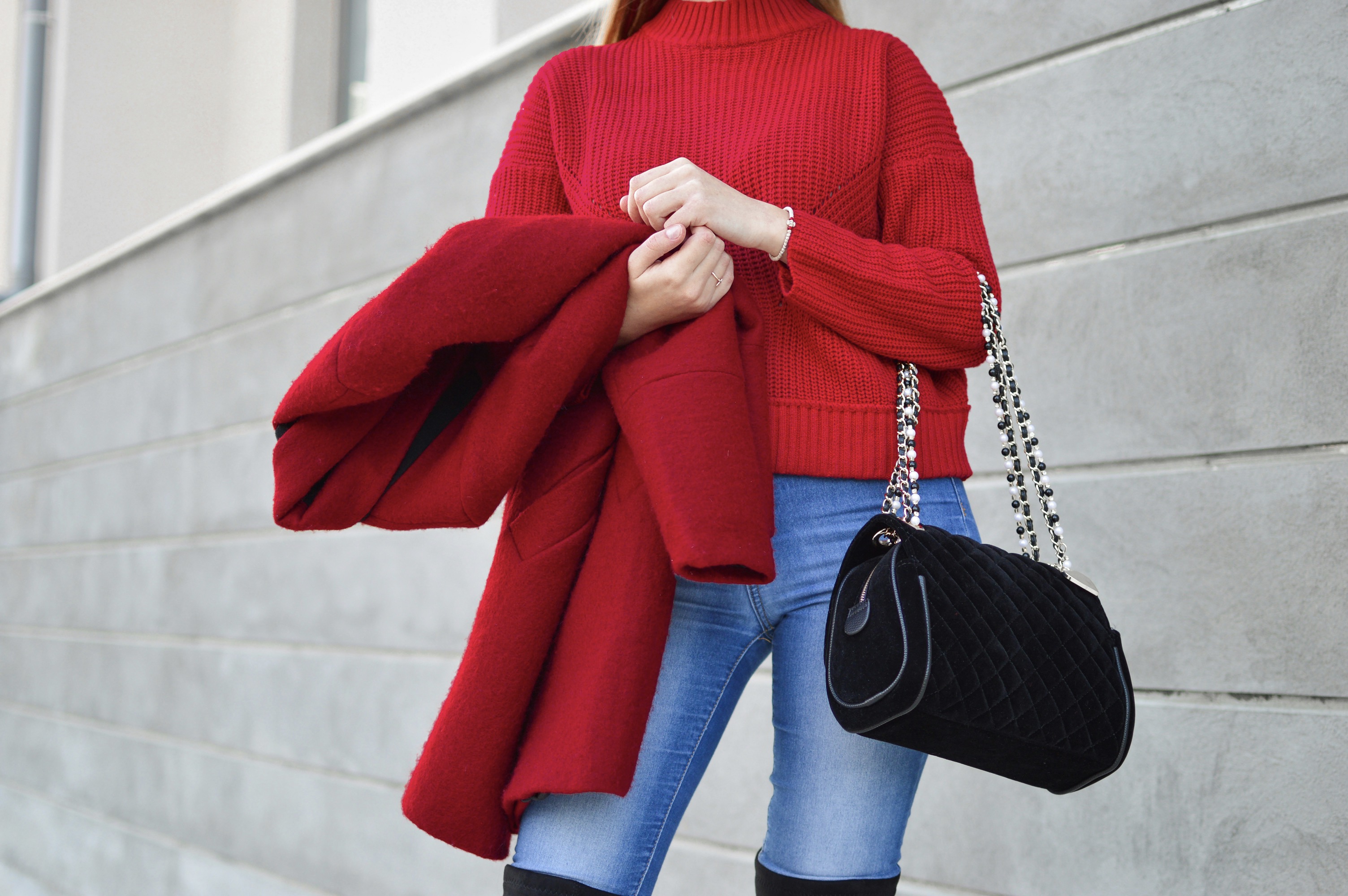
A high-contrast look thrives when one piece dominates while others recede into supporting roles. For example, a charcoal suit with a vivid cobalt shirt creates a clean stage for color drama without clutter. The key is rhythm: repeat a subtle cue, such as a metal zipper detail or a textured weave, across different garments so the eye moves smoothly. Subtle repetition reinforces cohesion and signals intentional design. When you vary only texture—crisp cotton, glossy satin, matte knit—you gain depth that keeps the outfit contemporary. Balance emerges from a shared cadence rather than a patchwork of disparate statements.
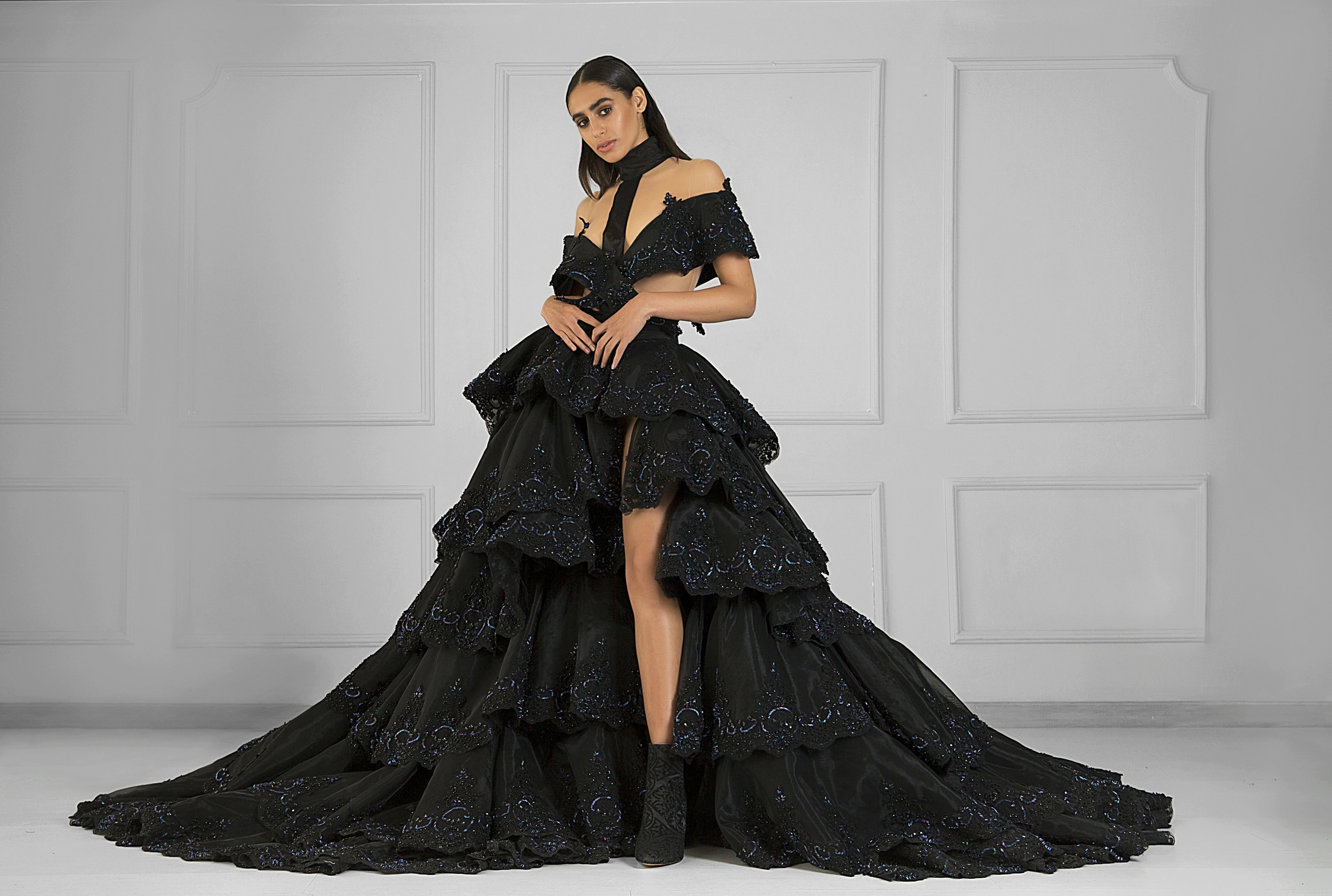
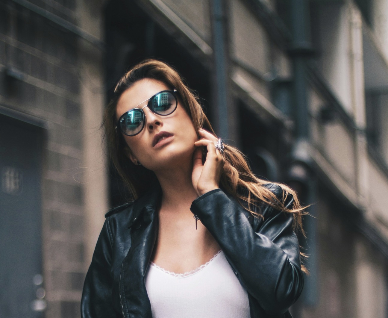
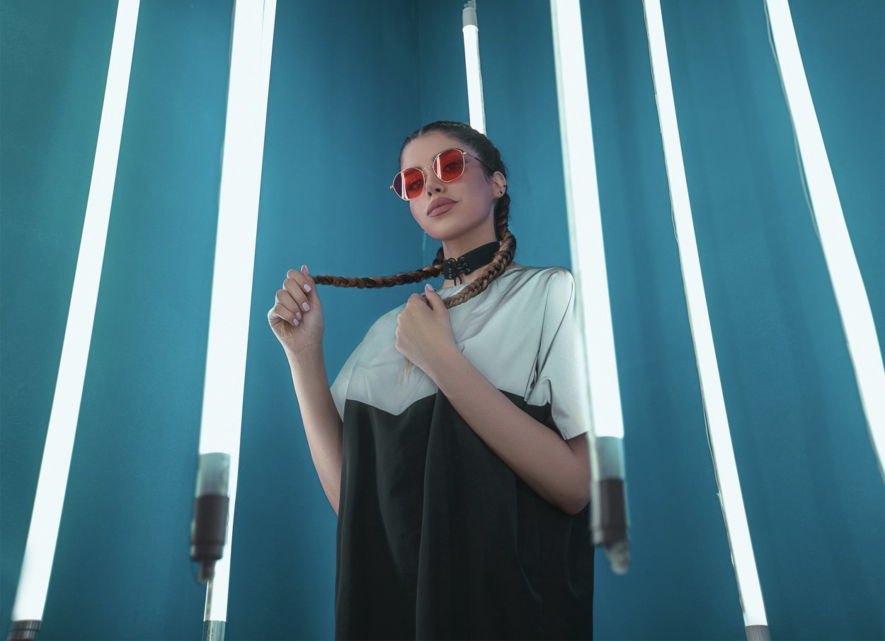
Fabric weight and finish sharply influence how contrast behaves on the body. A glossy patent boot paired with a matte wool-coat reads futuristic, while a soft cashmere sweater against a satin skirt elevates elegance. If you want a dramatic yet wearable result, combine a high-shine piece with something tactile and grounded, such as a rugged leather belt or a chunky knit scarf. The trick is to let one finish dominate while the other remains understated. By curating textures with intention, you create an outfit that feels modern, wearable, and visually compelling across different lighting and settings.
Proportional play with color creates a modern, wearable silhouette.
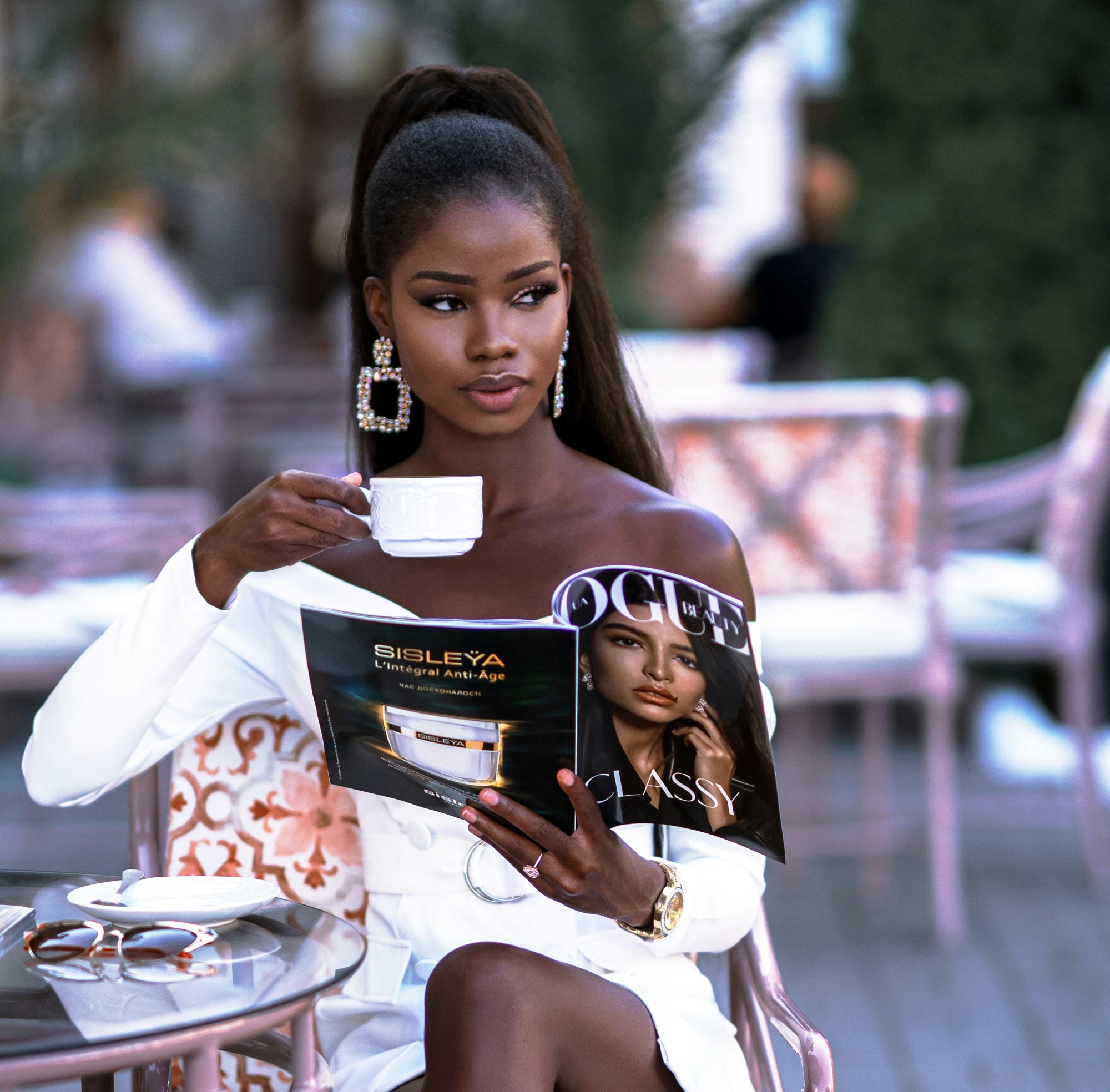
When selecting high-contrast outfits, prioritize lines that flatter your silhouette. A strong contrast can distort proportions if the cut is awkward, so scout tailoring that emphasizes verticality and clean edges. A straight-leg pant with a tucked-in, bright top creates a streamlined silhouette that lengthens the leg line. If you prefer fluid shapes, mirror the contrast with a long, lean tunic over tailored leggings and ankle boots. Accessories should be minimal but precise: a slim belt, a structured bag, and understated jewelry. The aim is a modern, cohesive look that maintains proportional balance while letting color do the talking.
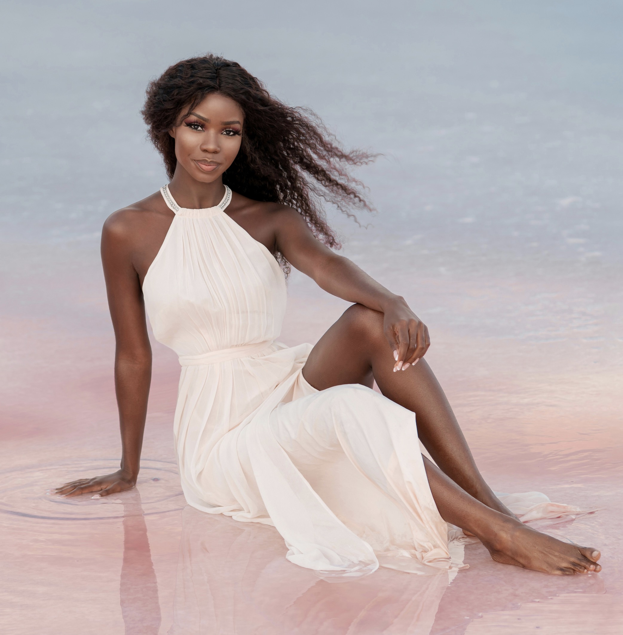
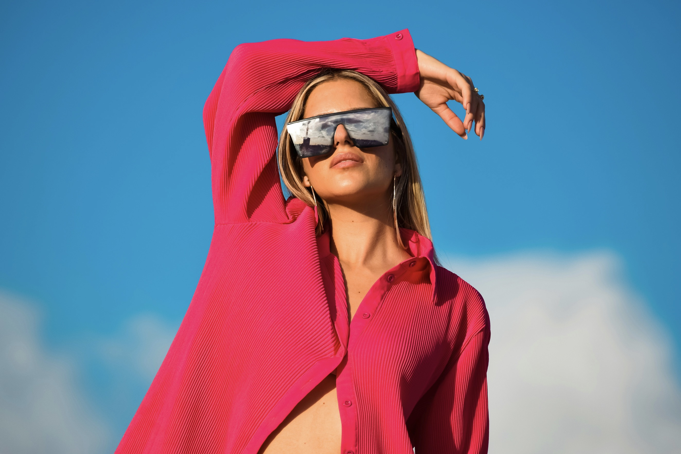
Color theory guides practical decisions about wearable balance. Primary colors demand restraint elsewhere; use neutrals to temper intensity. Secondary colors can ride together if grounded by a consistent base. For instance, a deep forest gown with a coral scarf can feel contemporary when the shoes and bag stay within a similar tonal family. Don’t shy away from black mixed with a surprising hue, but ensure the black elements are visible across several pieces to unify the outfit. With careful calibration, you’ll achieve a dynamic ensemble that respects proportions and remains versatile for day-to-night wear.
Everyday practicality supports bold, modern contrasts.
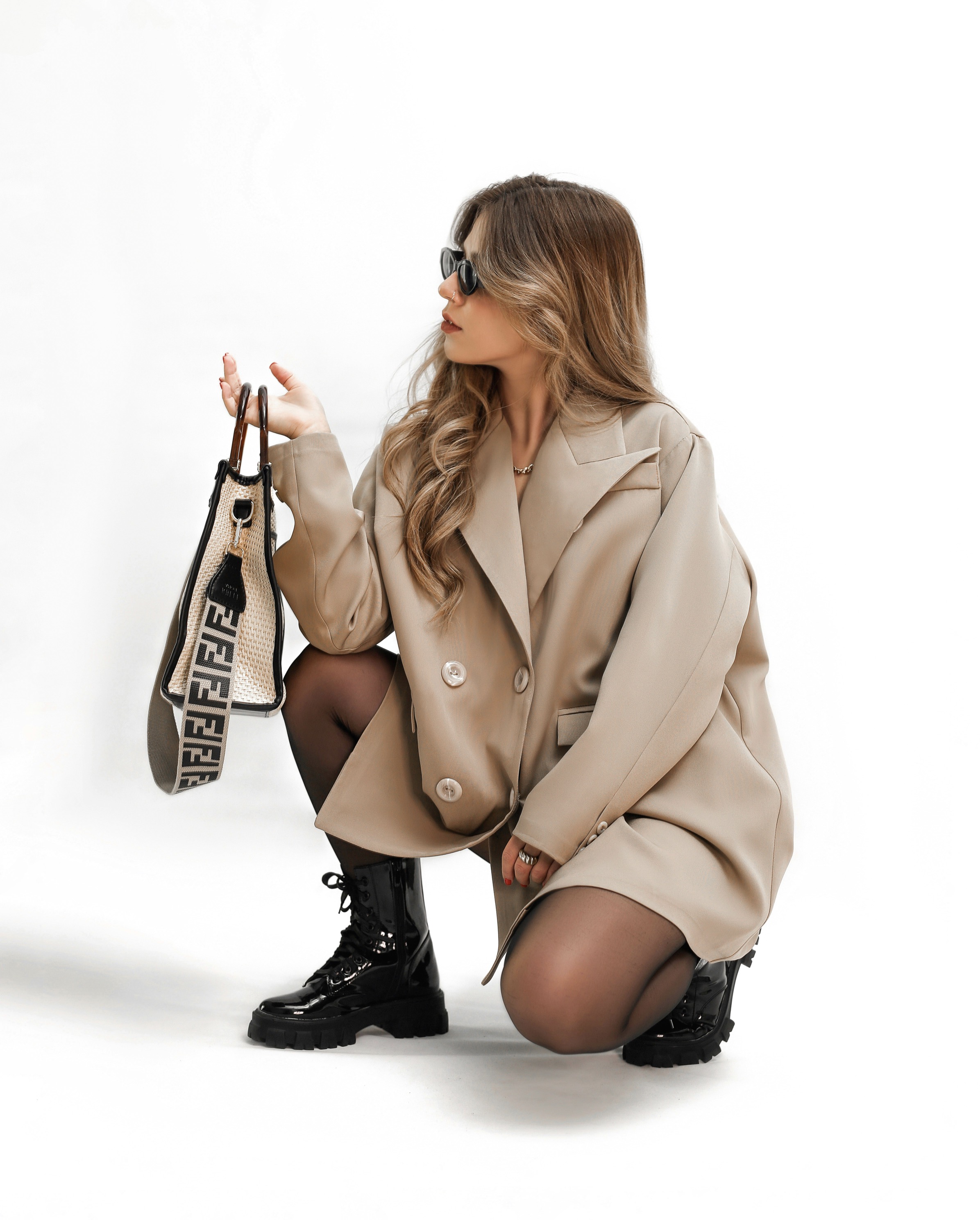
A practical method is to build outfits around one hero piece in a bright color, then layer neutrals to scaffold the look. Start with a bold coat or a saturated dress, and add midtone layers like gray, taupe, or ivory to calm the palette. The accessories should pick up a thread from the hero piece—perhaps a belt or a bag in the same hue family—to knit the ensemble together. This approach prevents visual overload while preserving a contemporary edge. Experiment with length and volume to further refine proportion; a long-line coat over cropped trousers often reads poised and fashion-forward.
When weekend wear meets high contrast, comfort and practicality become essential. Opt for sturdy fabrics with subtle stretch to retain shape during movement. A black base with a bright, structured top can translate to casual chic at brunch or a casual meeting. Footwear should balance the look’s energy: a sleek sneaker in a coordinating color lands as modern, while a heeled boot adds polish for evenings out. Consider weather-appropriate fabrics—topped with a weatherproof outer layer—to ensure the contrast remains appealing from morning to night.
Accessories and tailoring unify bold color into daily life.
Layering is your ally for wearable high-contrast dressing. Start with a quiet foundation such as a neutral tee or turtleneck, then add a saturated outer layer that bandpasses color without competing with the base. This technique creates depth and dimension while preserving movement fluidity. Keep jewelry sparse to avoid competing focal points. The layering principle helps adapt the same outfit to fluctuating temperatures and occasions, preserving a contemporary vibe. The goal is to look intentional, not accidental, with each layer contributing to proportion and rhythm rather than clutter.
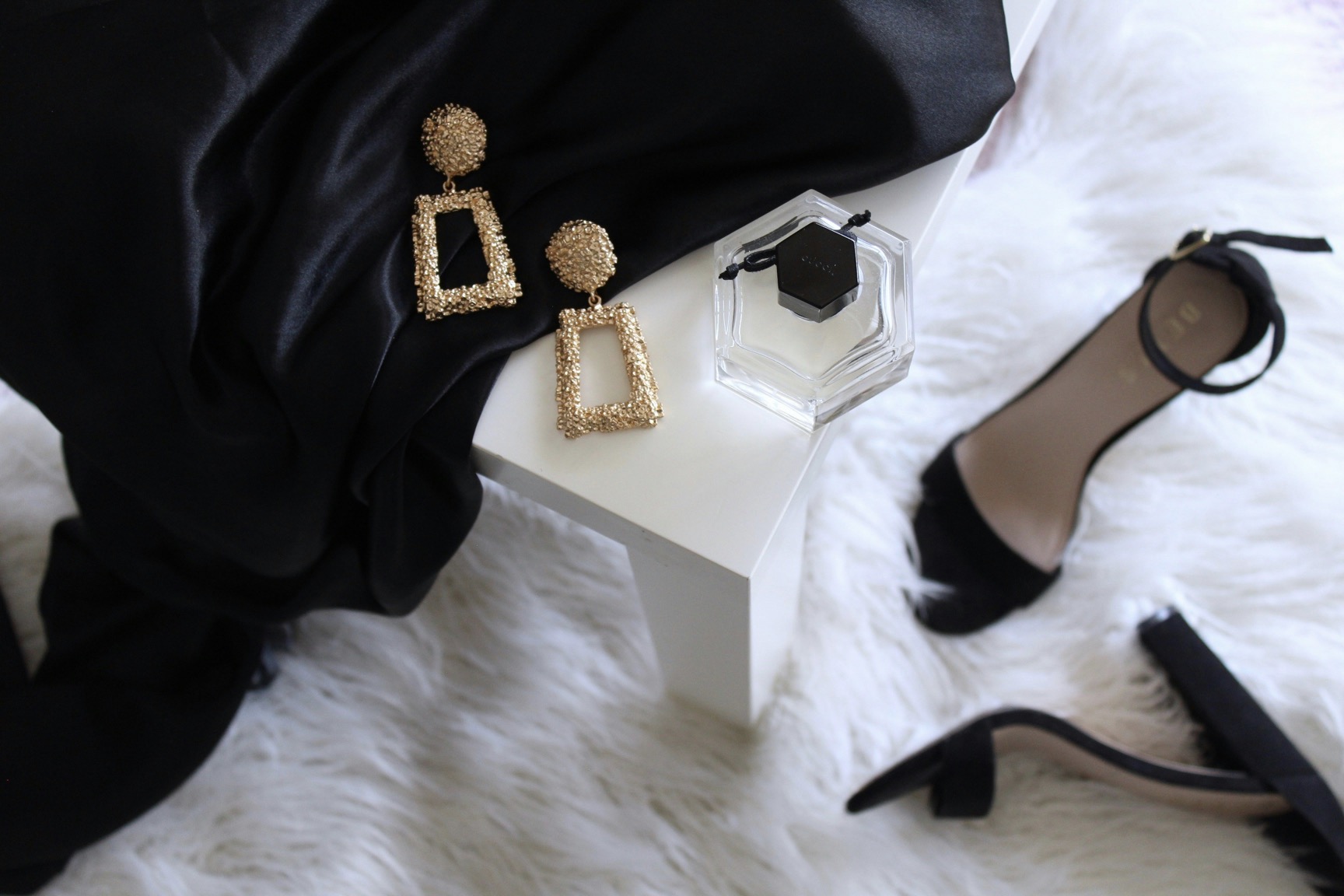
Accessories act as bridges between bold colors and everyday wearability. A belt, hat, or bag in a unifying hue can tie disparate pieces together while keeping the overall look balanced. When your main color is strong, choose metallic or neutral hardware to avoid disharmony. Shoes should neither dominate nor disappear; they should anchor the ensemble with a complementary finish. By treating accessories as design punctuation, you empower your high-contrast outfit to remain versatile, credible, and evergreen across seasons.
Proportion extends beyond garments to how you wear them. The length of a jacket relative to pants, the rise of your trousers, and the hemline of a dress all influence perceived balance. If your aim is a modern, wearable statement, favor clean lines and crisp tailoring over excessive layering. A single pop of color benefits from soft neutrals that prevent fatigue. Similarly, ensure your underlayers stay comfortable and unseen, so the outer contrast remains the focus. Thoughtful tailoring creates a refined silhouette that supports confidence and ease in real-world scenarios.
Finally, practice makes perfect when mastering high-contrast outfits. Start small with accessory-level experiments, then gradually expand to complete ensembles that feel natural to wear daily. Observe how different environments—office, cafe, evening events—affect color perception, and adjust your proportions accordingly. Document outfits that succeed and those that feel forced, then refine your approach. The most enduring style thrives on consistency, proportion, and a personal sense of balance. When you align these elements, high-contrast dressing becomes a signature that stays modern, wearable, and true to your everyday life.